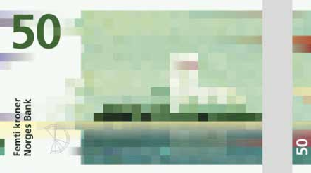
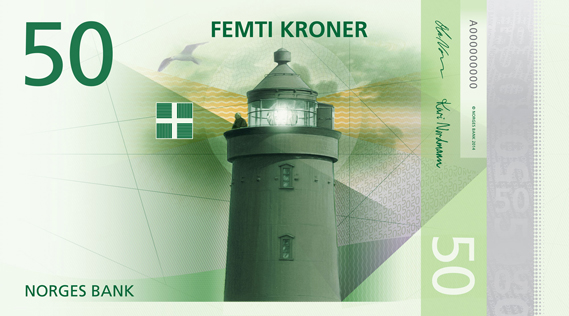
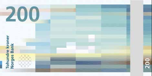
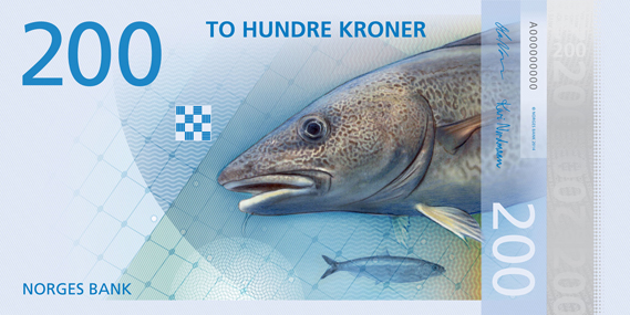
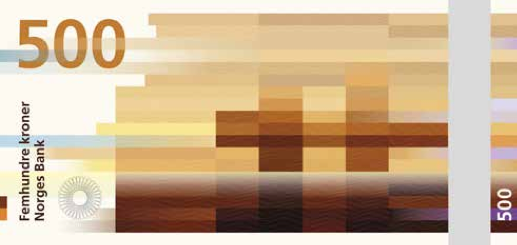
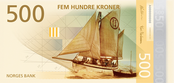
I thought it would be a good idea to look at some radically modern bank note design to gain inspiration for my own design treatment. I think for the purpose of this brief, it would be beneficial to take inspiration from contemporary design, as bank note design is such an ancient art. I want my designs to feel contemporary, fresh and exciting whilst at the same time paying homage to traditional aesthetics and conventions of successful bank note design. I first took a look at Norway's new bank note designs, which are drastically different from anything I have seen before. They are abstract, minimal and striking.
There are
few acts of graphic design more daunting than that of creating a new face for
an entire country's currency. Even in a world full of digital payment methods,
cash still passes through the hands of essentially every citizen, as well as
international travellers. Much like the national flag, it's a visual
representation of a country's identity. And there are not only political
factors to take into account when deciding what—or who—should
be represented on bills, but security issues and anti-counterfeiting measures
to consider. These considerations are things that I will need to bare in mind, but not in the sense of national pride. I will need to think closely about which signs and symbols I can use to best represent the theme of evil. Norway's brand new currency
design manages to be not just passably interesting, but beautiful.
What I like the most is the evident creative freedom that the designer had with this brief. On one side of the note is a pixelated image, the other side features a distinct illustration. They feel like works of art, yet they are obviously functional pieces of design. This balance must not have been easy to strike, yet the designer has achieved it effortlessly.
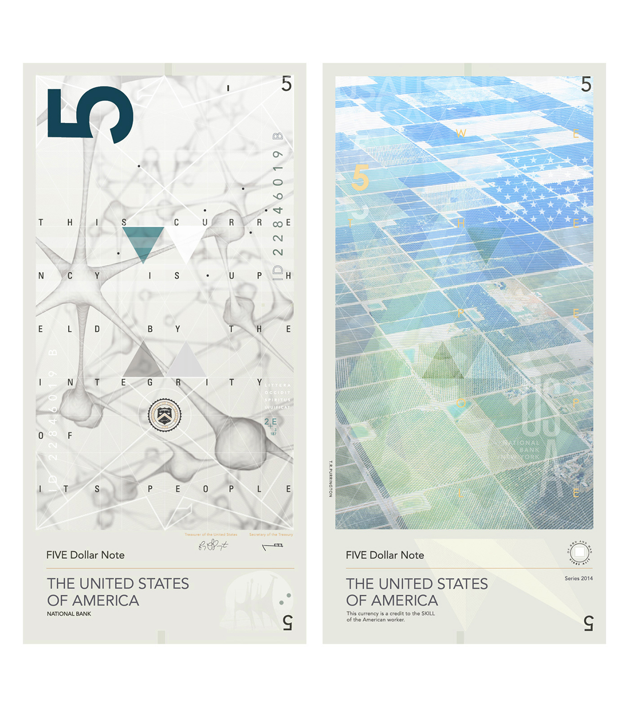
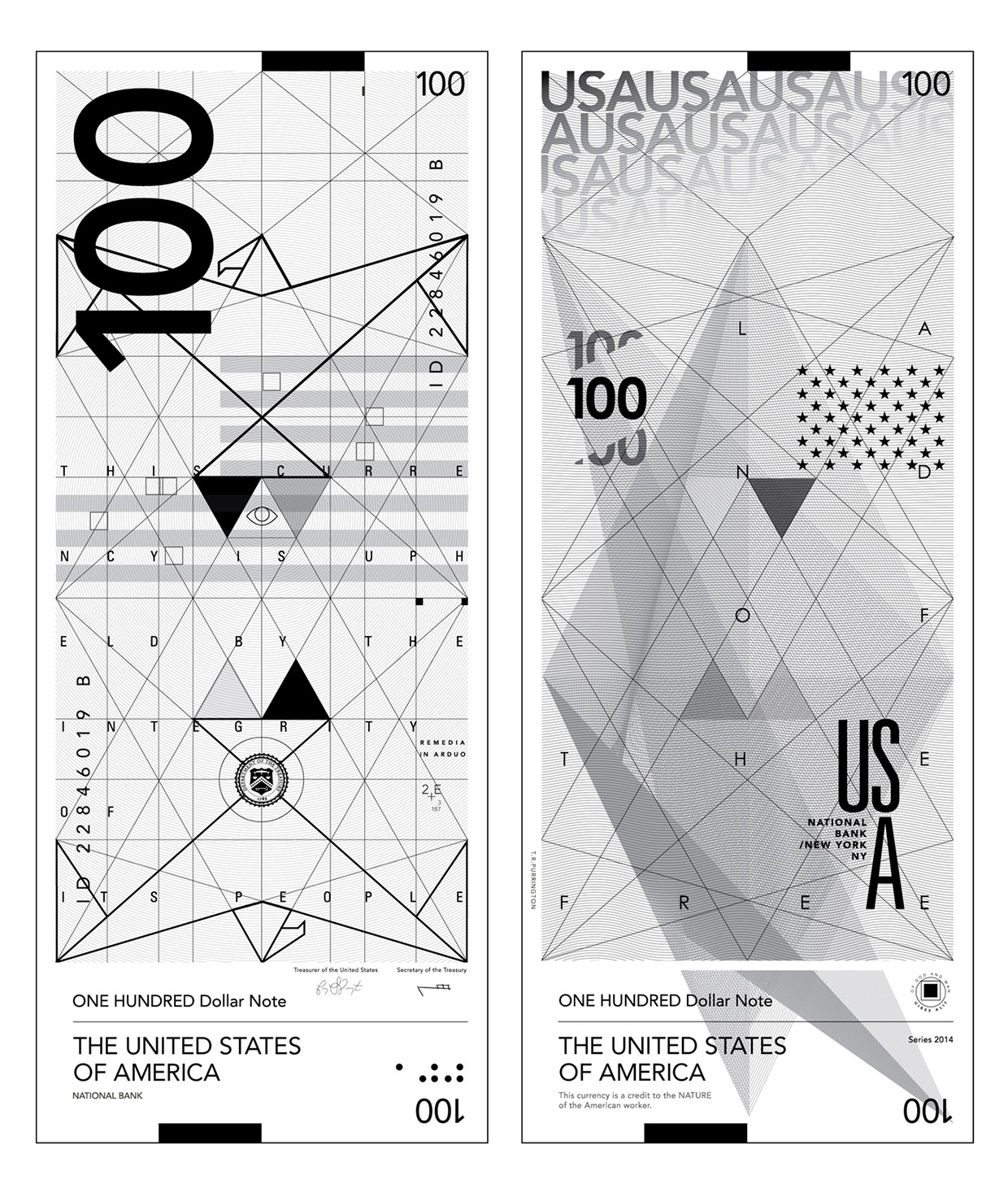
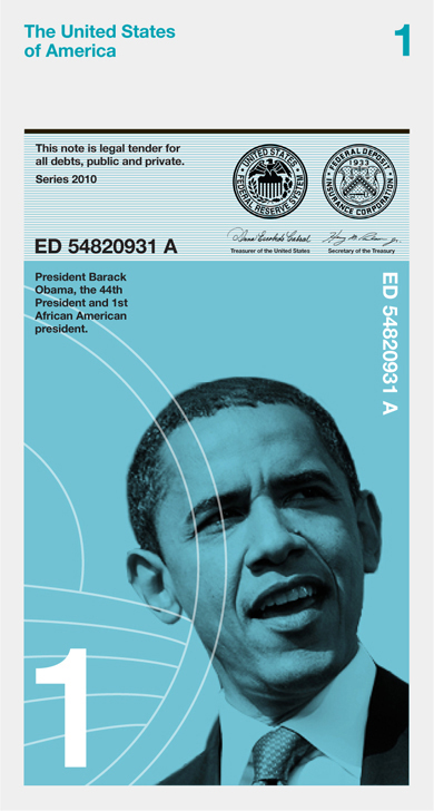
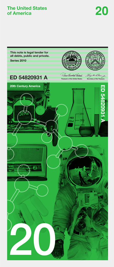
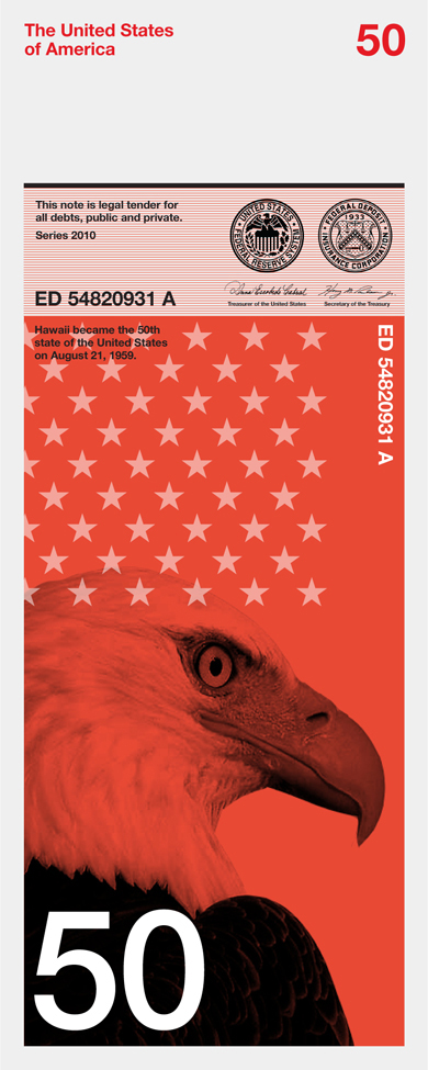
Below are various examples of the American Dollar Bill re-imagined. Similarly to the Norwegian designs, they are very minimal, light and distinctly modern. They feature sleek illustrations and photography, which is pretty unconventional in my opinion. I'm not really a massive fan of these designs, because they are so drastically different to their predecessors. I think when it comes to designing new banknotes, there needs to be some agreement between the old and the new, a hybrid of traditional and contemporary aesthetics. To me, these designs below do not achieve this.

No comments:
Post a Comment