OUGD504 - Brief 04 - Informal Feedback Session
- Do you know who Grace
Jones is? If not what would you like to know about her?
¼ of the people in the crit group actually knew who she was, which I wasn't really that surprised by. They said they wanted to know what genre
of music she makes, what her style is like, perhaps to include a really small biography to give people a bit of background
information, what she was like when album came out, perhaps any upcoming gigs or special performances to promote the album? There needs to be links to social media, this is where further information about her as a recording artist/performer can be included rather than within the actual campaign website
- Do you think a GIF
functions well as a ‘cover page’ which the user has to click to enter the main
site?
Yes, its interactive and gives you a flash of visual information,
exciting, fulfils the brief in terms of including some form of moving image. There are a lot of directions that you can go down in regards to GIFs, The 'collaged GIFs work well, but play around with the speed's, be careful to not make them too fast otherwise the information could get lost in translation Consider refining them and simplifying them

- Do you think a colour
scheme that represents the colours on the album cover should be used, or a
scheme that is more fresh and contemporary?
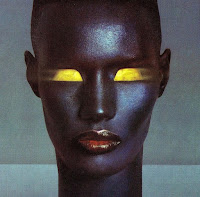
Yes, the purple and orange tones that run throughout the original album artwork also run throughout other photographs of Grace taken around the time the album was originally released. The tones on the album cover are really aesthetically pleasing and are a ready made colour swatch that can be applied to the website - go with those colours
- Should the colour
scheme be light or dark?
A darker colour scheme is more appropriate, it is reminiscent of retro clubbing scenes and matches Grace's self made aesthetic well
- Should I try and use typefaces that replicate the original type used from the 80s, or use a typeface which is very dissimilar? Try and make it a bit more stylised or contemporary?
Using fonts that imitate the originals is a nice touch, gives it more of an identity and a rounded feel, tying in the old with the new.


No comments:
Post a Comment