I am interested in producing a typographic campaign that tackles a particular human rights issue, so I did some visual research into a couple of campaigns that I was already very much aware of and engaged with. Stonewall, an LGBT charity released a campaign several years ago now, which aimed to educate people about homophobia, with an ultimate aim to eradicate it. The campaign utilised its typography perfectly, giving it a very clean, bold and strong message. The posters are highly minimal, but because the message is set in capitals and a sans serif has been used, they feel very important and bold. I think the type used is most likely Futura Extra Bold. This type decision gives it a very contemporary feel, whilst also being as 'neutral' as possible. The campaign is about beating discrimination, and Futura offers that solution. I also feel the use of colour is important in making a strong impact. Red connotes warnings and danger, it is also highly eye catching from a distance. Being homophobic is dangerous and needs to be treated as a serious thing, so I can completely understand the decision to use bright red throughout this campaign. This campaign is warning people, telling them to simple accept others for who they are.
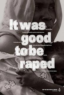
Similarly, in these campaign posters by Amnesty International, a bold, neutral sans serif has been used to communicate the content in a way which is simple yet very effective. The poster feature two colours, which again increases their visual impact. Bold colours such as yellow are very eye catching, and the black type contrasts perfectly, allowing the written content to be communicated effectively.
These posters are interesting because the typography has been formatted in a way which requires the reader to really look closely, instead of taking the content in the design for face value. It would appear that the poster is sending out a negative message until you look closely at the smaller type set in-between the larger letters. This type of design is useful for when you have a lot of written content to include, but I think that my designs for this brief will be less text heavy in order to communicate my intended message quicker.
Although photography has been used in these posters, the typography stands out and delivers the main message to me. The imagery works well in the background, but the playful use of scale and positioning of the type adds an element of sophistication to the design and requires the audience to delve deeper to uncover the true underlying message here.


No comments:
Post a Comment