I decided to extend my visual research into existing brands/company's with more or less the same name as the brand that I am designing for. I came across a number of very effective iconic logos that didn't incorporate type at all. I found it very inspiring how the form of a sheep had been compressed down to its simplest form yet remained completely recognizable. All of the logos are completely unique, they all differ tremendously in style. This has inspired me to make my logo as stylised as possible. I want the logo to reflect my own artistic/creative style whilst still suiting the needs of the client.
This iconic logo is one of my favourites. It's so slick and minimal yet functions so well. It reminds me of Japanese design because it is completely line based and curved, which reminds of Japanese typography design. I apprieciate the facial expression of the sheep character, it adds a touch of friendliness to something that has the potential to be really corporate and lifeless.

Similar to the logo above, this iconic logo is very minimal yet communicates its intended purpose effortlessly. Iconic logos tend to be quite geometric and rounded, and that is something that I want to try and steer clear of in my logo design. I appreciate minimalistic vector design such as this, but for the purpose of this brief and the client, I want to develop my analogue design skills and really incorporate earthy textures, and vectors will not offer me those specific qualities.

This example is much more illustrative and has a very detailed aesthetic. For me it is a bit too busy but it is conceptual and content aware. I think logo's should be simplistic to a certain extent and communicate ideas through sophisticated visual queues. This logo goes that step further and incorporates a number of visual symbols to create quite an intricate logo.


This logo has cleverly combined type and image to create a logo that subtly communicates its intended message, very inspiring.

I like the illustrative nature of this logo and the subtle use of baby blue. The use of colour here is highly appropriate to the brand name. This logo has decided to opt for minimal facial features, something that I am aiming to replicate in my own designs. I think this is a good decision as it prevents the logo from becoming too cartoon like. Appropriate use of positive and negative space is central to a successful logo design.

I like the grungy aesthetic of this logo. It looks as if the designer has attempted to replicate a hand rendered effect but it was most likely designed exclusively on a digital platform. Never the less, it is still quite an striking logo. The sheep here has eyes, but no other facial features which I think is a wise decision.


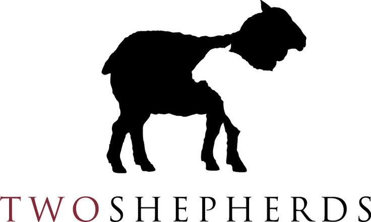
Very simplistic design, I like the way the typography and the icon interact in quite a graceful way.

Brilliant use of positive and negative space, to create almost an optical illusion.

These illustrative logos really caught my eye. This type of visual style is what I want to achieve through my designs. The logo on the right incorporates hand rendered type beautifully as it is designed to fit with the overall shape of the animal.

No comments:
Post a Comment