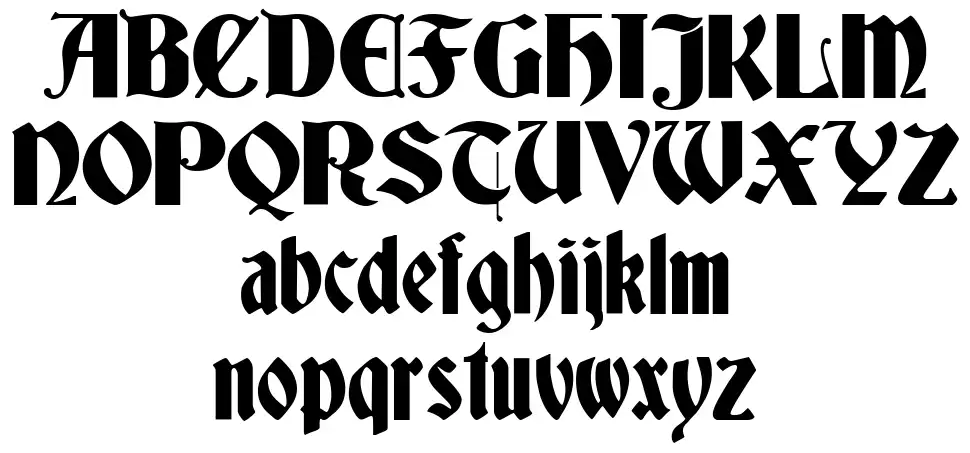
After trying out a large number of type combinations, I finally settled on the pairing of a striking contemporary black letter font for the headings, and a refined, sophisticated humanist slab serif for the body copy of the content. I have chosen to use Deutsch Gothic for my headings. This free typeface is striking, unusual and highly appropriate within the context of this project. It is highly suitable for headings rather than large sections of body copy type. Instead of filling in the type with a solid colour, I chose to use a very light stroke weight around the outlines of the type and filled this with white. The effects to me are really interesting and definitely give the front cover and the first page of information a contemporary feel/aesthetic. I think out of all the black letter fonts that I tried out, this is the most elegant and pays a subtle reference to the more traditional and ornate gothic fonts that I found at the actual cemetery.
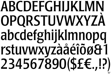
For the body copy, I found a really beautiful contemporary slab serif. This typeface is perfect for body copy, as it is highly legible at a very small point size. It is reminiscent of typography found in cemeteries but also has a very current feel to it. It looks stunning when set in white against an all black background.
Below are a few examples of the development of the aesthetic of my design so far. I am still keeping the format of the book tall and thin to pay reference to tombstones. I am also going to format the imagery inside in a similar way, tall and thin. I am planning on using a lot of black throughout the design to achieve high levels of contrast, and because I think black suits the overall theme of the content and the look and feel. And because black is one of my personal favourite colours.


No comments:
Post a Comment