

I decided to see what Bebas had to offer my design. I quite like its contemporary feel, and I also liked the way it contrasted quite dramatically with the roughness of the illustration. However, after receiving some quick feedback I realised it wasn't suitable for this design. People made the point that it looked like an animal cruelty campaign, it is just a bit too harsh, especially when underlined. I agreed with these points of critique, so I moved on to look at other typefaces and experimented a lot with hand rendered type.
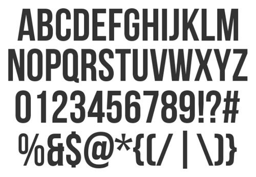
Bebas Neu experiments:

Here you can see I have experimented with type composition. I also introduced a small bar of black on the right of the logo in an attempt to make it visually balanced. I am not 100% sure what it actually has to offer the design at this stage, I am most likely going to get rid of it. However, for the purpose of development it was interesting to try it out.

No comments:
Post a Comment