Saturday 31 October 2015

OUGD504 - Brief 03 - Development of Layouts

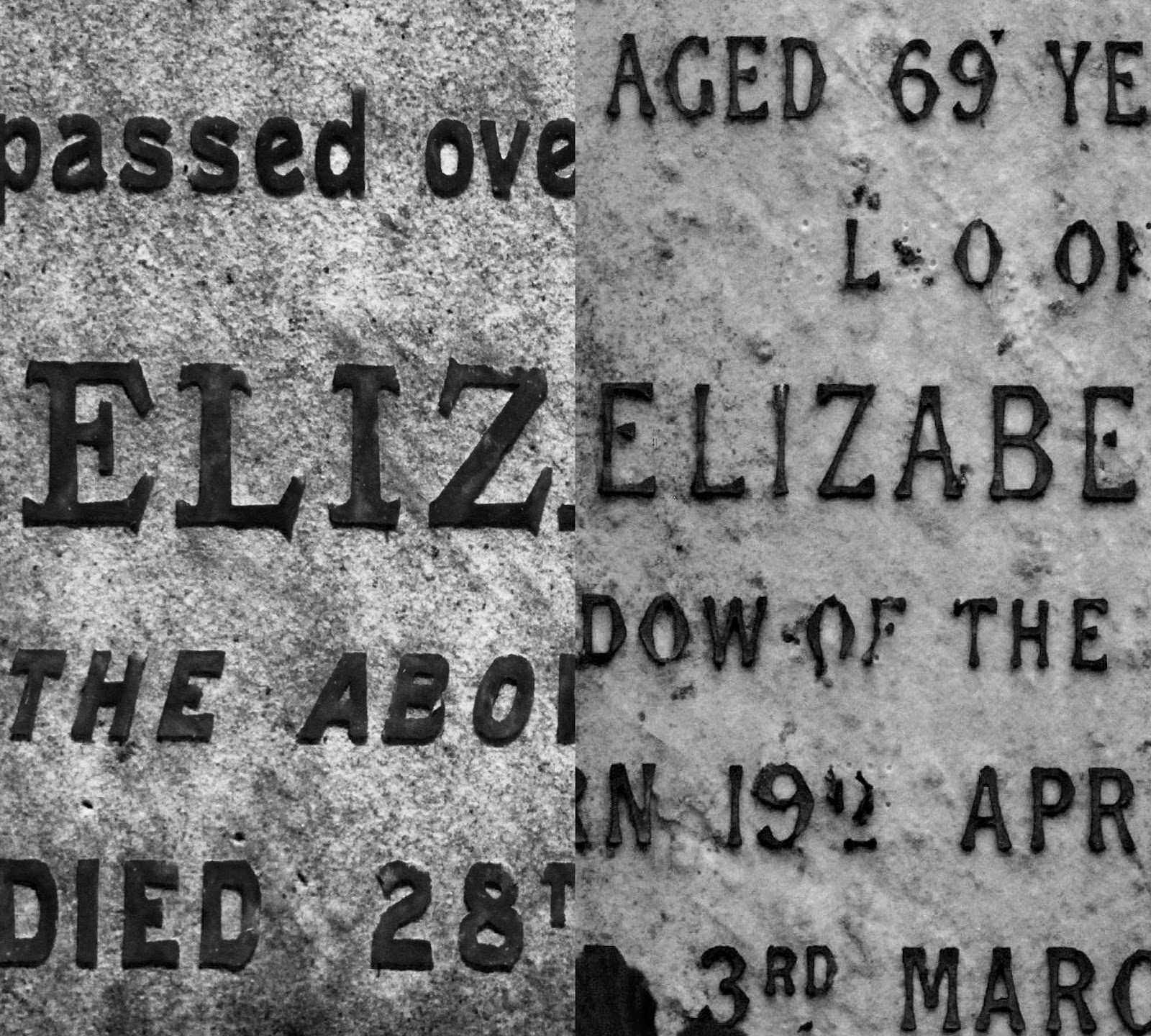
Once I had settled on a suitable type combination, I went back and decided to tweak the layouts of the double page spreads. For the first few spreads, I have included full bleed photograph. Opening the publication this way lets the audience/reader know right away that this publication is a photography focused one, there is little emphasis on textual information. I have then included a very brief introductory page, summarising the cemetery's background history in very few words. You then move onto another double page full bleed spread and then you are greeted with a table of contents. I didn't want to put lines and lines of text describing each letterform next to the photographs, so I decided to tackle the issues using a table of contents/index system, which I think is effective in communicating the information efficiently. I then turned my attention to the actual layout of the photographic content. In the earlier stages of this brief, I employed a quite strict two column gird system to format my images, but I threw that grid system out of the window here. I have opted to layout the images in a more abstract way. Some images take up the whole page, others home in and focus on specific letter forms. The varying sizes and positioning of the images makes the spreads and overall publication flow more freely. Flicking from page to page is a bit more exciting this way. I am happy that I decided to tweak and push the layouts to this point. 


Friday 30 October 2015

OUGD504 - Brief 03 - Further Primary Research

I decided to revisit Village Bookshop to refresh my mind and get further inspiration for this brief. I have generated multiple layouts for my publication but none of them have completely satisfied me. Experimenting and pushing ideas around a lot is how I function as a designer and it really helps me to do my best. Flicking through a number of Village's publications was really visually stimulating and I came away feeling inspired to try out some more unusual layout designs. I tried to pick out books that were predominately monochrome in aesthetic. I was paying particular attention to the formatting of the images, grid systems if any, binding methods, stock choices and good use of print finishing techniques. Below are a selection of images that I found the most visually enticing and diverse:  

I really like the alternating sizes of images in some of the publications. Full bleed imagery can be nice if the image quality is high enough, but I find it much more interesting when there are varying sizes of images to look at. In terms of thinking about production, full bleed imagery can tend to get quite expensive as it obviously requires more ink. I need to consider these costing issues when designing my publication, using smaller images and formatting them in a way that is similar to the spread below may prove to be more cost efficient and environmentally considerate. 


This publication used a very simple staple binding method. I have used this technique before, it is incredibly easy and doesn't look all that bad. I am considering either stapling my publication or stitch/stab binding it. Staple binding is cheap and easy to do, and can be used on a commercial scale which is something I must consider throughout the remainder of the design process. 


Further examples of full bleed double page spreads: 


This cover design caught my eye. The black stock was really beautiful to look at and feel. It felt really sophisticated and premium. A spot varnish had been applied to set the title, which I thought was a great touch. Black on black is highly sleek, I want to look into experimenting with varnishing my cover design onto a heavy jet black stock. The effect is very aesthetically pleasing but at the same time subtly stylish.