Who
Designed the cover, are there any links between them and the book?
What
is the intended message?
What
are the semiotics behind this message and how/why have they been used to
support the message/content?
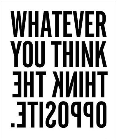
There are no illustrations or photographs used on this particular cover design so in that sense there are no semiotics. However, there are semiotics associated with the use of the typography here. By simple reversing the direction of the type and inverting it suggests a different way of thinking and is forcing the reader to approach the design in a different way to which they may have approached it if it used conventional type. The semiotics here are all about challenging the norm and going literally in the opposite direction to the crowd.
There are no illustrations or photographs used on this particular cover design so in that sense there are no semiotics. However, there are semiotics associated with the use of the typography here. By simple reversing the direction of the type and inverting it suggests a different way of thinking and is forcing the reader to approach the design in a different way to which they may have approached it if it used conventional type. The semiotics here are all about challenging the norm and going literally in the opposite direction to the crowd.
Is
the cover successful in communicating this message/content?
Are
there any counter-arguments, if so how could this be better communicated?
You could argue that the lack of imagery makes the design boring and many would agree with that. But from a design perspective, the use of type only is very aesthetically pleasing. Below the title is 'Paul Arden, author of the world's best selling book' this could be seen as a bit annoying perhaps showing off, some may not like this but for me this arrogance works well with the rest of the design and show's how much of a pro Arden is at giving advice. It's confidence and confidence is something that Arden promotes within the book. It is key to success.
You could argue that the lack of imagery makes the design boring and many would agree with that. But from a design perspective, the use of type only is very aesthetically pleasing. Below the title is 'Paul Arden, author of the world's best selling book' this could be seen as a bit annoying perhaps showing off, some may not like this but for me this arrogance works well with the rest of the design and show's how much of a pro Arden is at giving advice. It's confidence and confidence is something that Arden promotes within the book. It is key to success.
No comments:
Post a Comment