 The brief suggests that I use a variety of approaches in gathering the research, including editorial coverage in local, national and international press via both print and web. I should aim to observe the trends and differences between different formats of communication. I looked at several news publishing websites both national and international to aid my research.
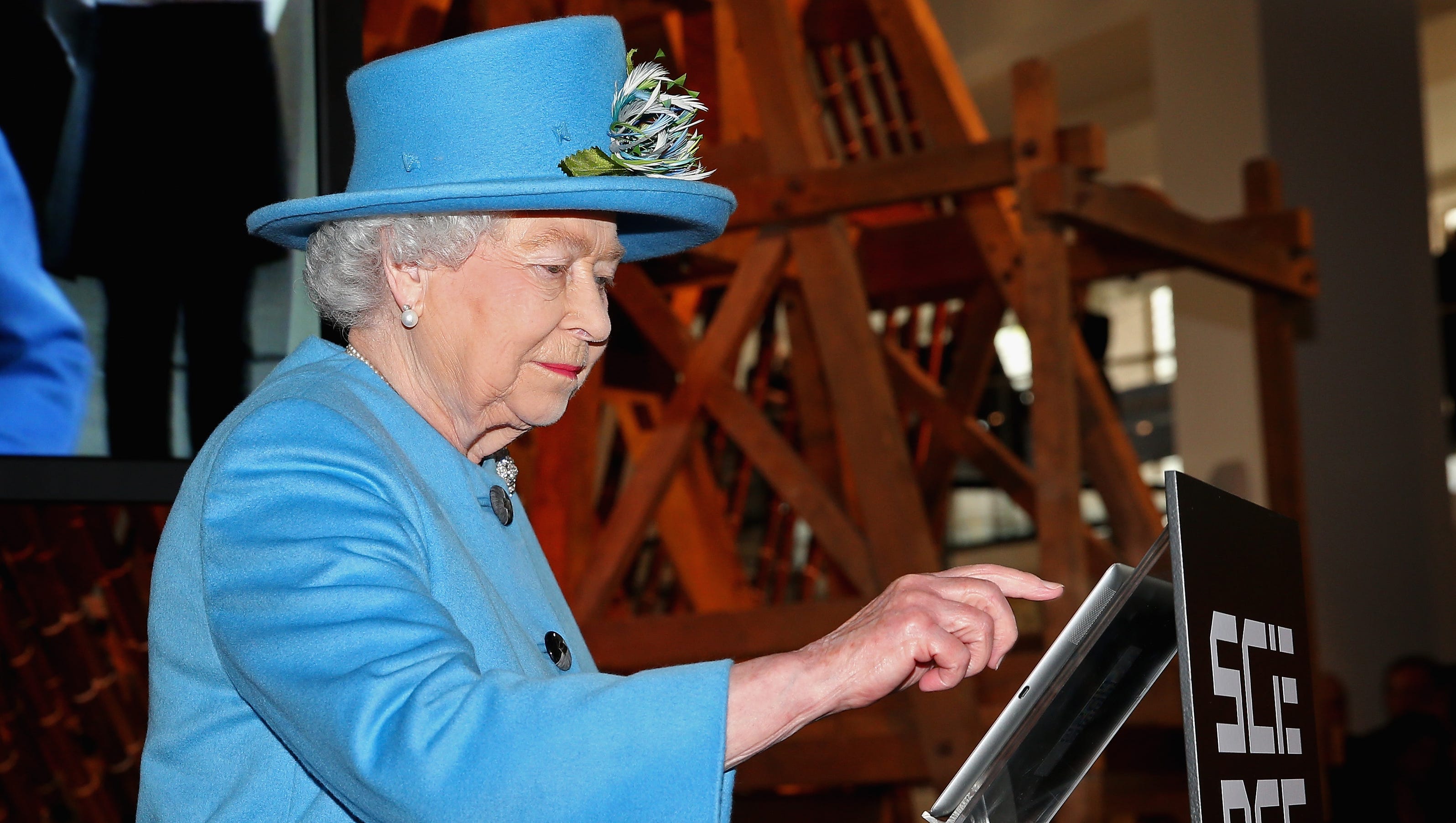
 After flicking through the three physical newspapers that I selected I came across a story in all three that I found interesting. On Friday the 24th of October, Queen Elizabeth II sent her first ever Tweet. This headline grabbed my attention as it wasn't too serious or depressing but quite entertaining and fascinating at the same time, The actions of the Queen have sparked aggressive and disrespectful reactions from members of the Twitter community. The Queen was the first member of the Royal family to send an email back in 1976, which was a milestone at the time. The fact that in 2014 she is engaging with the rapidly changing world of social media shows her willingness to go with the flow of technology and embrace modern society in all its connected glory. I think it is great that the Queen has apparently decided to use Twitter, its not gimmicky at all in my opinion, its in fact one of the most down to earth things someone like her majesty, with all the status and power she has, could do.
Brief summary of the story, taken from the Daily Express Online:
http://www.mirror.co.uk/news/uk-news/one-not-amused-trolls-attack-4501842
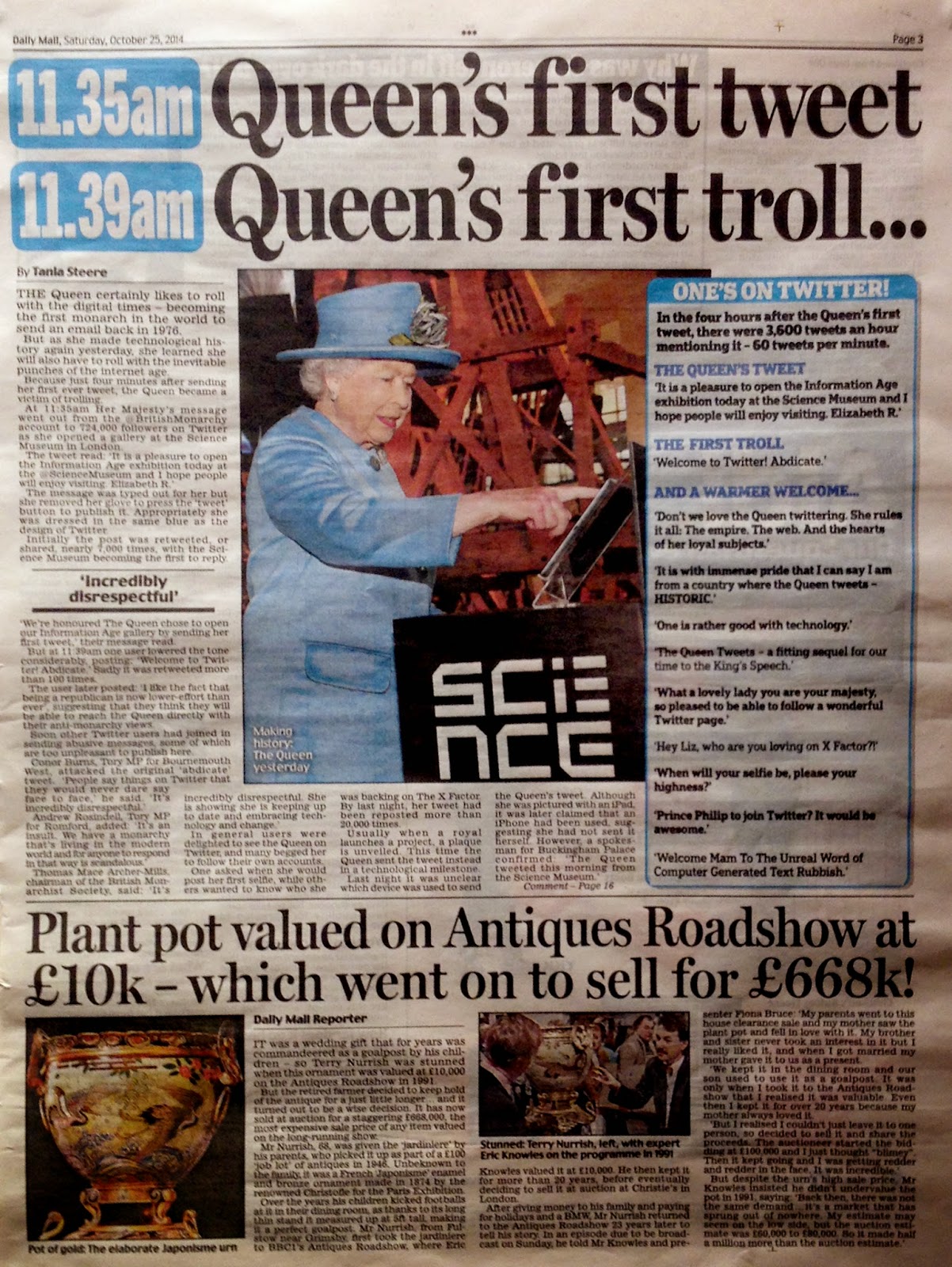
A very modern monarch: The Queen sends her FIRST ever tweet and makes history. The royal tweet read: "It is a pleasure to open the Information Age exhibition today at the @ScienceMuseum and I hope people will enjoy visiting. Elizabeth R."The Queen's tweet was retweeted more than 3,500 times within 45 minutes and the number of followers of the @BritishMonarchy account jumped from 722,000 to 731,000 in about the same space of time.
Her tweet was also beamed around the capital on the electronic message board on the BT Tower in London
The Daily Mail: used a blue theme throughout the article which is clever yes and will draw in the attention of people who are familiar with Twitters branding and theme. To my eyes as a designer I find it a bit cheesy, but I can see how this would make the article more interesting to an unassuming reader. To me this decreases the formality to a certain degree, probably the most informal of the three. Uses the same image as the the Daily Mirror so this deceases its edge over the other publishers. The Times is the only one to use an image that is well balanced and well framed in my opinion.
The Times:very formal in tone of voice, lots of writing that's in depth and gives plently of perspective to the story. I find this article a lot more opinionated and comprehensive. Not trashy like a tabloid. this is the reputation that the times has anyway. Stricter use of columns gives the article a much more formal tone of voice compared to the cluttered layouts of the other two newspapers. Overall serif feel makes it feel more formal (social context) longer sentences and less use of colloquial terms. All type used is very thin in weight, this decreases the informal tone.

The Daily Mirror: probably the least formal of the three newspapers I looked at. The headline is in a sans serif. It's bold and quite informal. They have used a column grid to layout the article, but there is much less content compared to The Times. This article is my favourite, its concise and to the point. Its use of screen shots from Twitter as well as Twitters logo decrease the formality but the information is communicated effectively, I found it the easiest to relate to. The journalist who wrote the article, Victoria Murphy also wrote an online version of this story. Online the rules are completely different. The sentences are shorter and the information is communicated across much more concisely. The opening lines of the online article read:

"Trolls attacked the Queen almost immediately after she posted her first tweet.
She made the historic post, signing off as Elizabeth R, from London’s Science Museum as she opened an Information Age exhibition celebrating advancing technologies.
But Her Majesty’s account was immediately targeted by vicious trolls, who posted such vindictive comments as “F*** off and die”." The tone online is quite different, much more informal than in printed versions.
No comments:
Post a Comment