I will look to de-construct websites, newspapers, spreads etc to identify the use of grids and their purpose. I will look for links between use of typography and grid systems in context to the target audience and purpose of layout. Identify trends between column usage and word count.
What is a grid?
A grid subdivides a page vertically and horizontally into margins, columns, inter-column spaces, lines of type, and spaces between blocks of type and images. These subdivisions form the basis of a modular and systematic approach to the layout. The grid serves as an armature on which a designer can organise graphic elements (images, glyphs, paragraphs) in a rational, easy to absorb manner. A grid can be used to organise graphic elements in relation to a page, in relation to other graphic elements on the page, or relation to other parts of the same graphic element or shape.
There are several reasons why designers use girds. These epitomise the micro and macro concerns of graphic designers:
Various Types of Grid:
What is a grid?
A grid subdivides a page vertically and horizontally into margins, columns, inter-column spaces, lines of type, and spaces between blocks of type and images. These subdivisions form the basis of a modular and systematic approach to the layout. The grid serves as an armature on which a designer can organise graphic elements (images, glyphs, paragraphs) in a rational, easy to absorb manner. A grid can be used to organise graphic elements in relation to a page, in relation to other graphic elements on the page, or relation to other parts of the same graphic element or shape.
There are several reasons why designers use girds. These epitomise the micro and macro concerns of graphic designers:
- Grids are practical, particularly for producing multiple-page documents. They make production processes far more efficient and build a visual consistency into the design that should help the end user find their way around the page.
- Grids are fundamentally about a way of thinking. They bring structured thinking. Through the use of grids a designer is generally helping to make content accessible.
- Grids unite the practical with the aesthetic. They are about the organisation of objects in space and this involves making aesthetic decisions about proportion and scale.
- The history of the grid's development is convoluted and complex. Modern graphic design, as we know it, is a young profession, but incidences of grid use pre-date the Romans and the Greeks. The grid that is used in Western graphic design evolved during the industrial revolution. The term 'grid' came into common use just after the Second World War. The engagement with a wider audience is a political act, and at the time, many designers saw their role in socio political terms and wanted to be instrumental in building a new better world, after all that is what good graphic design is about. The grid was seen as the answer to create a better world through better graphic design
- There are of course even wider psychological considerations. Grids can been seen as metaphors for the human need to make sense of the world and to position ourselves in control of it. The straight lines of a grid have been criticised as symptomatic of a preoccupation with progress that is actually limiting and one-dimensional. Designers often mistrust this appropriation of this simple design tool, considering it irrelevant and pseudo-intellectual.
- Grid Terminology:

- Flow-lines - alignments that break the space into horizontal bands
- Format - the area in which the design sits. In a book or magazine the format is the page, on an internet browser the format is the browser window
- Modules - individual units of space separated by regular intervals
- Spatial zone - groups of modules banded together to form distinct fields
- Markers - Placement indicators for subordinate or consistently appearing text
- Columns - Vertical alignments of type that create horizontal divisions between the margins
- Rows - the horizontal equivalents to columns
- Margin - Negative space between the format edge and the content
Various Types of Grid:
- There are many different types of grids used by graphic designers to create brilliant layout and composition. A grid doesn't necessarily have to be straight lined, some grids can be curved or rounded. There are four main types of grids used:
- Manuscript Grid: Sometimes called a block grid or single column grid, the manuscript grid is the simplest grid structure. It’s mainly a large rectangular area taking up most of the space inside a format. The primary structure is defined by large text blocks and margins, which position the block within the format. Its secondary structure defines the location and proportions of folios, footnotes, running headers, and other secondary information.Manuscript grids are good for extensive and continuous blocks of text. They’re used in books and long essays and perhaps lend themselves well to blog posts. They aren't limited to text, although images can be used to fill the block. They are simplistic but effective. Because of the simplicity of manuscript grids, typography plays an important role in creating visual interest. The choice of typeface, font-size, leading, measure, hierarchy, etc will make up most of the design choices.


Modular Grids: similar to column grids with the addition of horizontal divisions marked by rows. The columns and rows and the gutters between each create a matrix of cells or modules. These grids work well for complex projects that require more control than a column grid could offer. Image galleries use modular grids to display work. Google image search uses a modular grid system to display results. It's a brilliant way to display information. These grids lend themselves to the design of tabular information such as charts, forms, navigation, schedules and tables of data. They can help standardise the space in tables and help integrate tables with any surrounding text or images .
Column Grids: these grids are made up by placing multiple columns within the format.Column grids are good when discontinuous information needs to be presented. Columns can be dependent on each other, independent from each other, and crossed over by design elements. This leads to a large amount of flexibility when organising information on the page. You can separate blocks of info by placing them in different columns and yet still show a connection between them. Perhaps text in one column and image in another with captions in different columns next to the text the image relates to. A column should be able to accommodate a comfortable measure for reading and avoid excessive hyphenation at the end of the lines. Too wide or narrow a column and reading becomes difficult. Flow lines can be used in column grids to help subordinate structure or to allow for unusual breaks in text and images. Hang-lines and baselines can help establish where different elements will be positioned vertically within the columns
Hierarchical Grid: these are commonly found on the internet. They're based more on an intuitive placement of elements which still conforms to the needs of the information. Customised proportions are typically used in hierarchical grids instead of regularly repeated intervals. Column widths tend to vary as do the location of flow-lines. They can be thought of as more organise and loose compared with quite strict constrained grids such as column or modular types. Development often begins by spontaneously placing design elements. Later a rational structure to coordinate those elements is determined.
Each of the four grids have a different function as far as holding content and choosing the right grid to use should come down to the content for a specific project. Here is a brief summary of what each grid does:
-
the simplest and they work well when presenting large continuous blocks of text or images.
- Manuscript grids:
- Column grids: work well when the information being presented is discontinuous and different types of information can be placed in different columns.
- Modular grids: work best for more complex problems where columns alone don’t offer enough flexibility. The introduce horizontal spaces between blocks of content.
- Hierarchical grids: can be used when none of the above grids will work to solve the problem. They tend to be created organically by first placing design elements on the page and then finding a rational structure for presenting those elements.
Golden ratio:
Van De Graaf grids:
Grids and Modernism:
Grids in graphic design came of age during the the Modernist movement of the early 20th century. Swiss Graphic Designers such as Josef Muller Brockmann pioneered grid design. He worked meticulously within the grid and swore by its constraints. Brockmanns' minimalist approach to design is stunningly effective.
"The grid system is an aid, not a guarantee. It permits a number of possible uses and each designer can look for a solution appropriate to his personal style. But one must learn how to use the grid; it is an art that requires practice. ”
Josef Müller-Brockmann
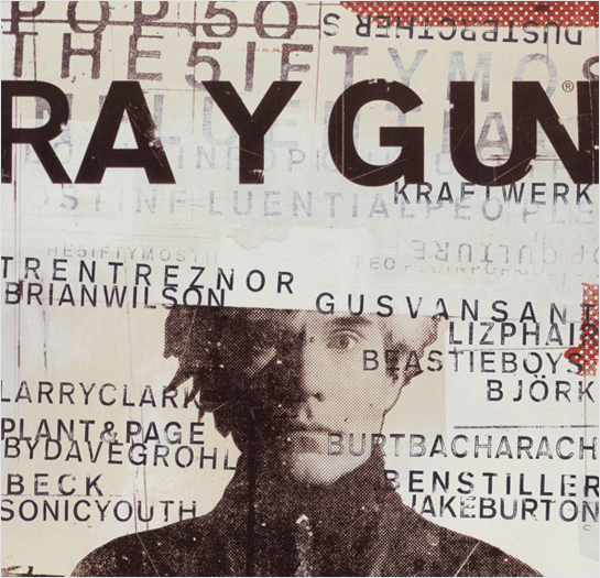
Breaking Out of the Grid:Once the grid is established, it is up to the designer when and how to break out of it. Grid systems are there to maintain order, however rules are made to be broken. This doesn’t mean the grid system in graphic design will be completely ignored. Instead, elements may cross over from column to column, extend to the end of the page, or extend onto adjacent pages. Breaking out of the grid can lead to the most interesting page designs. David Carson is synonymous with breaking the rules. His 'grunge' designs of the 1990s are great examples of how disregard for grid systems can actually create really successful design. An example of Carson's work below demonstrates the concept of breaking out of the grid. His presentation of information is disjointed. Some would argue that this makes it harder to read or understand, but from a creative view point I think it is brilliant. This makes Carson's design truely

Examples of grids in context: Grids are everywhere, without realising it or not, grids can be applied to a huge range things. I decided to grid up a mug shot of myself. It was fairly straight forward. Features like the eyes and mouth align almost perfectly which was interesting to see.


Elsewhere:
Grids are everywhere, in nature, architecture, graphic design and in fine art. The world famous abstract and modernist painter Piet Mondrian is famous for his abstractions. Mondrian arrived at his mature style of 'pure' abstraction around 1920, while living in Paris. He shunned all references to nature, and restricted himself to squares or rectangles of primary colours, set in white fields and bounded by intersecting straight lines. His work expressed, he believed, the principles of 'plastic equivalence', or what he termed 'neoplasticism'. With planes of primary colour balancing planes of non-colour (white, grey or black) and vertical lines opposing horizontal lines, and both acting to define the planes, his works embodied, he thought, principles of balance and harmony, principles that are fundamental to graphic design. Mondrian has had an incredible impact on popular culture, fashion and design. He was a pioneer of abstract art, but his work to me has a distinct graphic feel and I really like it.

http://www.vanseodesign.com/web-design/grid-anatomy/
http://www.vanseodesign.com/web-design/grid-types/
'The Designer and the Grid' - L. Roberts, J. Thrift - RotoVisionhttp://guity-novin.blogspot.co.uk/2011/07/chapter-42-swiss-grade-style-and-dutch.html
http://www.graphics.com/article-old/brief-history-gridshttp://guity-novin.blogspot.co.uk/2011/07/chapter-42-swiss-grade-style-and-dutch.html#Two
http://retinart.net/graphic-design/secret-law-of-page-harmony/
Studio Practice: Ougd404 - Design Principles - Grid, Layout And Composition >>>>> Download Now
ReplyDelete>>>>> Download Full
Studio Practice: Ougd404 - Design Principles - Grid, Layout And Composition >>>>> Download LINK
>>>>> Download Now
Studio Practice: Ougd404 - Design Principles - Grid, Layout And Composition >>>>> Download Full
>>>>> Download LINK sa